Content & Comparison Carousel


Content Carousel
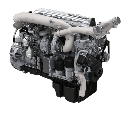
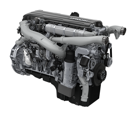
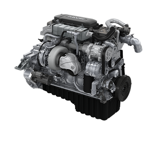
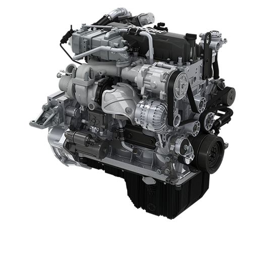
The content carousel can be used with circular pictures for linking to (customer) testimonials or with 'showcase' pictures
(e.g. DAF models to link to product pages).
This component contains placeholders that can be filled with Content Cards.
Grid:
This component can only be added to the 100% grid - centered.
Template:
/sitecore/templates/Project/Common/Content Types/Teasers/Content Carousel
Note:
On mobile devices you can swipe horizontally to view all Content Cards.
Content Cards
This component can be added to the placeholders available in the Content Carousel.
- Title
- Subtitle
- Image: The image that is shown on top of the card
- Summary: Short introduction text
- Link & Link text
Template:
/sitecore/templates/Project/Common/Content Types/Teasers/Content Card
Image size (width x height):
590 x 590
For testimonials please use circular pictures with transparant background (.png files).
'Showcase' pictures also should have a transparant background (.png files).
Comparison Card 1
Lorem ipsum dolor sit amet, consectetuer adipiscing elit. Aenean commodo ligula eget dolor. Aenean massa. Cum sociis natoque penatibus et magnis dis parturient montes, nascetur ridiculus mus.
- Comparison Item 1
- Comparison Item 2
- Comparison Item 3
- Comparison Item 4
- Comparison Item 5
- Comparison Item 6
Comparison Card 2
Lorem ipsum dolor sit amet, consectetuer adipiscing elit. Aenean commodo ligula eget dolor. Aenean massa. Cum sociis natoque penatibus et magnis dis parturient montes, nascetur ridiculus mus.
- Comparison Item 1
- Comparison Item 2
- Comparison Item 3
- Comparison Item 4
- Comparison Item 5
- Comparison Item 6
Comparison Card 3
Lorem ipsum dolor sit amet, consectetuer adipiscing elit. Aenean commodo ligula eget dolor. Aenean massa. Cum sociis natoque penatibus et magnis dis parturient montes, nascetur ridiculus mus.
- Comparison Item 1
- Comparison Item 2
- Comparison Item 3
- Comparison Item 6
- Comparison Item 4
Comparison Card 4
Lorem ipsum dolor sit amet, consectetuer adipiscing elit. Aenean commodo ligula eget dolor. Aenean massa. Cum sociis natoque penatibus et magnis dis parturient montes, nascetur ridiculus mus.
- Comparison Item 2
- Comparison Item 3
- Comparison Item 4
- Comparison Item 1
Comparison Carousel
This component contains placeholders that can be filled with Comparison Cards.
- Index of the active item: The optional active item index. This is a zero-based number for the first slide to show. So 0 is the first slide, 1 is the second slide. Default/blank is the first slide.
- Number of items: The total number of Comparison Cards in the carousel.
Grid:
This component can only be added to the 100% grid.
Template:
/sitecore/templates/Project/Common/Content Types/Teasers/Comparison Carousel
Note:
On mobile the Comparison Cards are placed underneath each other. The images are not shown on top of the card.
Comparison Cards
This component can be added to the placeholders available in the Comparison Carousel.
- Title
- Image: The image that is shown on top of the card
- Summary: Short introduction text
- Link & Link text
- (Optional) Comparison Items: A multi-select of Comparison Items. They are retrieved from the 'Comparison Items' folder at the same level as the Comparison Cards folder.
Template:
/sitecore/templates/Project/Common/Content Types/Teasers/Comparison Card
Image size (width x height):
590 x 590
Comparison Cards must be saved on Global or Sitewide level:
Global: /sitecore/content/Global/Global Comparison Carousels/Global Comparison Cards
Sitewide: /sitecore/content/DAF/Sitewide/Sitewide Comparison Carousels/Sitewide Comparison Cards
Comparison Items
Template:
/sitecore/templates/Project/Common/Content Types/Teasers/Comparison Item
Comparison Items must be saved in the 'Comparison Items' folder at the same level as the Comparison Cards folder:
Global: /sitecore/content/Global/Global Comparison Carousels/Comparison Items
Sitewide: /sitecore/content/DAF/Sitewide/Sitewide Comparison Carousels/Comparison Items